How to create a Sankey Diagram in MicroStrategy
In this blog let’s understand how we can create a nice-looking Sankey Diagram in MicroStrategy Dossier. If already know what Sankey Diagram is and why it is a useful visualization in Analytics then please continue reading this blog, if you want to deep dive first into Sankey Diagram and understand it thoroughly rather than blindly going to create it one in MicroStrategy then you can read our another blog here.
A Sankey Digram basically shows the flow of “something” from one channel/level to another channel/level. “Something” can be “Money” in case of Sales of a mutli-location organization or expenses of Marketing campaign of the same organization. we can easily understand the contribution of sales from different levels through the Sankey Diagram or say we can easily understand the leakage of funds at different stages or process of a marketing campaign.
What type of data we need in MicroStrategy to create Sankey Diagram
We need above type of data for our Sankey Diagram. you can dowload it here. Let me explain this a bit.
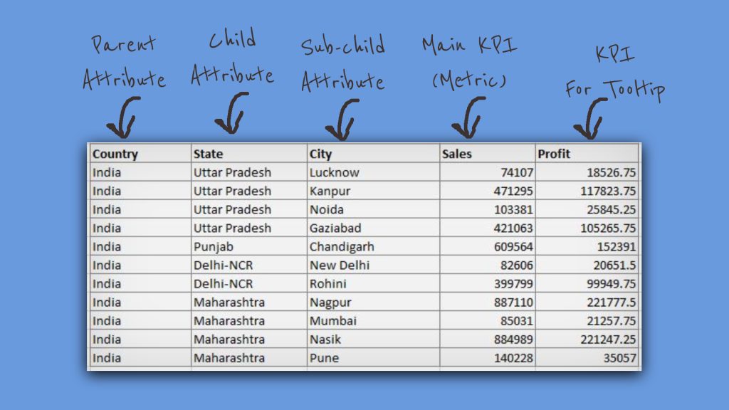
Let’s say we have an organization xyzexample.com, which operates its retail stores in India, primarily in 4 states and in some of their cities. above is the image of the data set I picked, you can prepare it easily in an excel worksheet.
We can understand from data that Country, State, and City must be having a logical relationship to channel the flow of money either outward(Expenses) or inwards(Sales).
“Sales” here is going to be our prime KPI which is flowing inwards, at three-dimension(level) of the data, we call them attributes in MicroStrategy, here – City, State, and Country. I have notified in the image above what our “Perent”, “Child” and “Sub-Child” attributes are going to be, don’t worry I am not going to talk about any hierarchy creation here.
First we are going to see how to bring this data into MicroStrategy. be prepare with an excel worksheet with such data.
Create a Dossier
One you have started creating a dossier you can see this type of window, shown in image below, doesn’t, weather you are creating a Dossier from Workstation or from MicroStrategy Web.
Import the Data
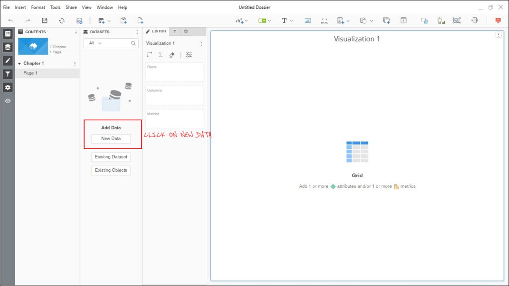
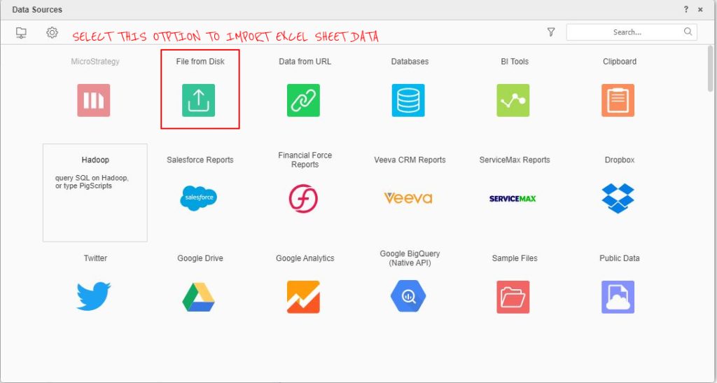
Step-1 – Click on “Add Data” option under “Datasets” tab.
Step – 2 – Select “File from Disk” Option in open popup, as shown below.
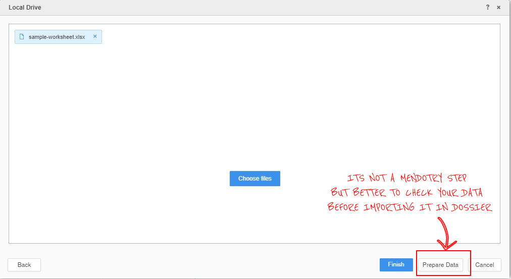
Step-3 – If you want to modal/clean/sanitize this data, say some formatting before importing it to Dossier, click on “Prepare Data” option else never mind, just click on “Finish” and skip Step-4 as shown in the next step.
Step-4 – If you have the same data as I showed above, you don’t need to do anything here, everything is just fine, eles there are number of things you can decide here, like creation of realtionship between attributes, what column must be a metric and what must be an attribute and other stuff like that; we will talk about that in some other blog.
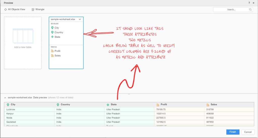
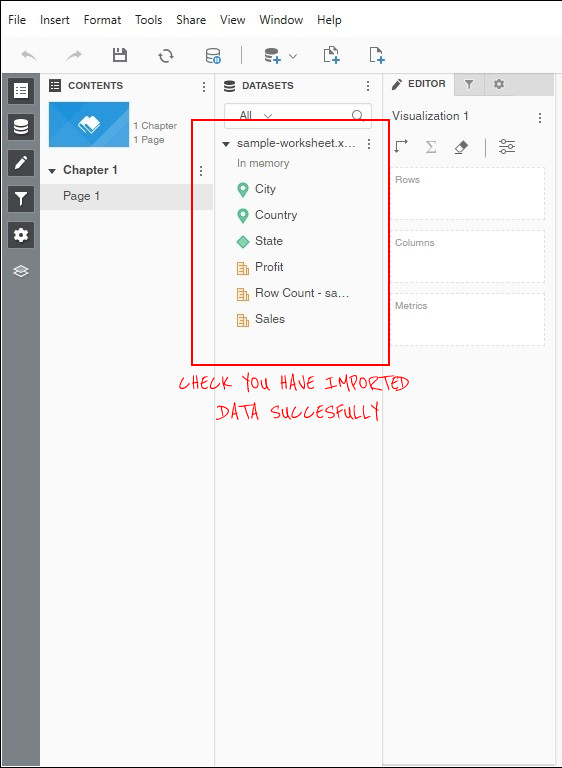
Step-5 – Once you click “Finish” in Step-4, you data is converted to ready-to-use dataset in MicroStrategy. After import we see that we have 3 Attributes “Country, “State” and “City”, on the other hand we have 2 metrics “Profit” and “Sales”. our focus is “Sales” here.
Sankey Diagram
To Bring Sankey Diagram here we have to follow steps 1 to 4 as show in below image, I will explain them after you are done performing them. see the image below.
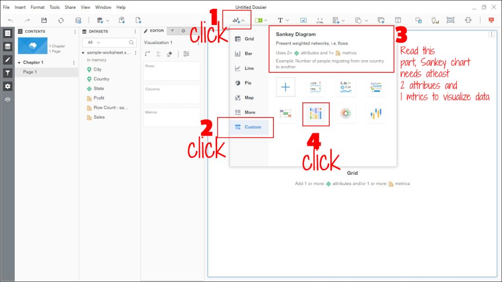
Above image will bring you a Sankey Diagram in your Dossier, but my focus is on Step-3 in above image.

Why Sankey Diagram is asking for atleast 2 Attribute and 1 Metric to show the visualization.
The reason is simple, remember the Sankey Diagram defnition, it shows the flow of “Something” from one place to another, and the leakage in between when it is an outward flow and reverse of the same when flow is inward, as in our example “Sales” is the inward flow of “Money” from atleast one chennel to another. Don’t worry, our data already has 3 channels – Country, Sate and City attributes, you can draw Sankey Diagram with 2 as well.
Final Step
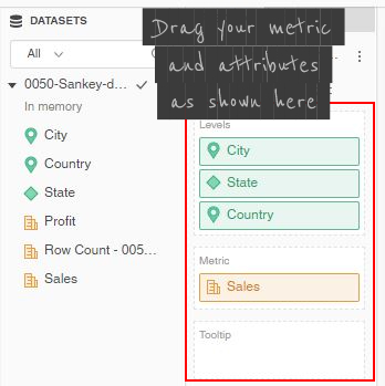
You have to drag County, State and City in “Levels” area. Levels will work as node on our Sankey Diagram, of course drag “Sales” Metrics in “Metric” area, which is our main KPI, you can drag other metrics in Tooltip are, just to show them when user hover over the diagram’s nodes. those will not impact any design pattern of our Sankey Diagram.
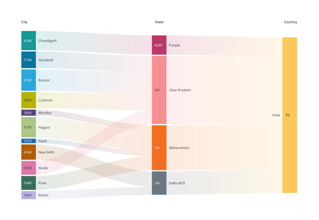
How the Diagram is going to look like lets see in next image.
Formatings of the Graph
If you want to format certain things of this graph, like color, data labels’ font etc. then check the format settings of this Graph, check the image below, and play around!
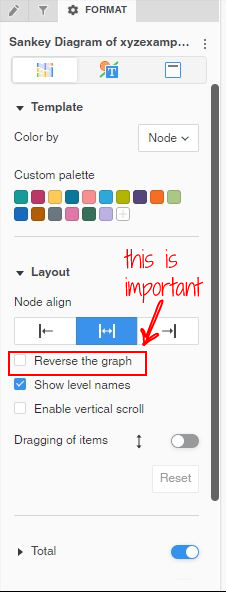
If you go to this option as shown in image, you can play with different formating settings related to Sankey Diagram.
As per definition, Sankey Diagram shows the flow of “Something” from one node to other, then why we are not seeing an “Arrow” in our Sankey Diagram ?
Because the direction of flow is an understood context, whether it is left to right or right to left and with the data example we used, we can understand that the direction of Sales contribution is towards country-level Sales, can we can decide on our own which side should country be plotted?
See the red rectanagle area of the image, now you got it, here we can decide which direction the flow should be of our beloved Sankey Diagram!
I kept it on default, and in that case, it will pick up the order of rendering from the order of attributes we have dragged in the Final Step above. No need to say, it will follow the logical relationship because of the nature of data we have from Country -> State -> City.
If you don’t like the order, go “Check” the “Reverse the Grpah” option and observe the difference.
Conclusion
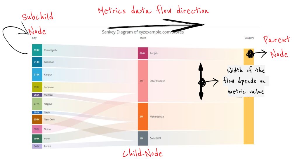
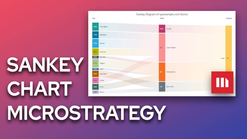
Just to help you further added this last image above. as you can see some editing, on the Diagram, it seems pretty self understood, let me just explaint a bit here. each colourful rectangle we see in the graph for e.g. “Nagpur” is called as “node” on the Diagram, and each node is dragable in “Upward” and “Downward” directions which means you can re-order them to understand the data better.
From the Diagram we can make an analysis that despite having 4 cities, Maharshtra state is contributing less to the National Sales as compare to the Sales done by Uttar Pradesh which has same number of cities, how we are concluding this, of course based on the width of the “Flow” from one node to another, see the difference in width of Uttar Pradesh and Maharshtra.
I hope you can create some nice visualization in MicroStrategy Dossier using Sankey Diagram. if you want to showcase them to the world do share on social media plateforms like Twitter and Facebook and tag @byteblogger22 to spread the word.
Happy Reading, Keep sharing!